
Critiquing my own student portfolio
Let’s take a stroll down memory lane. In 2012, I completed the Texas Creative program at the University of Texas. It’s one of the only programs that give undergrads an opportunity to build a real creative advertising portfolio.
And this is the student book that I graduated with. It has its ups and downs, but ultimately served its purpose (helped me get my start in the industry!). But how would I critique it if I were looking at it today? Let’s take a look…
Capri Sun
Drinking Capri Sun is fun. These pouches make it even more fun.
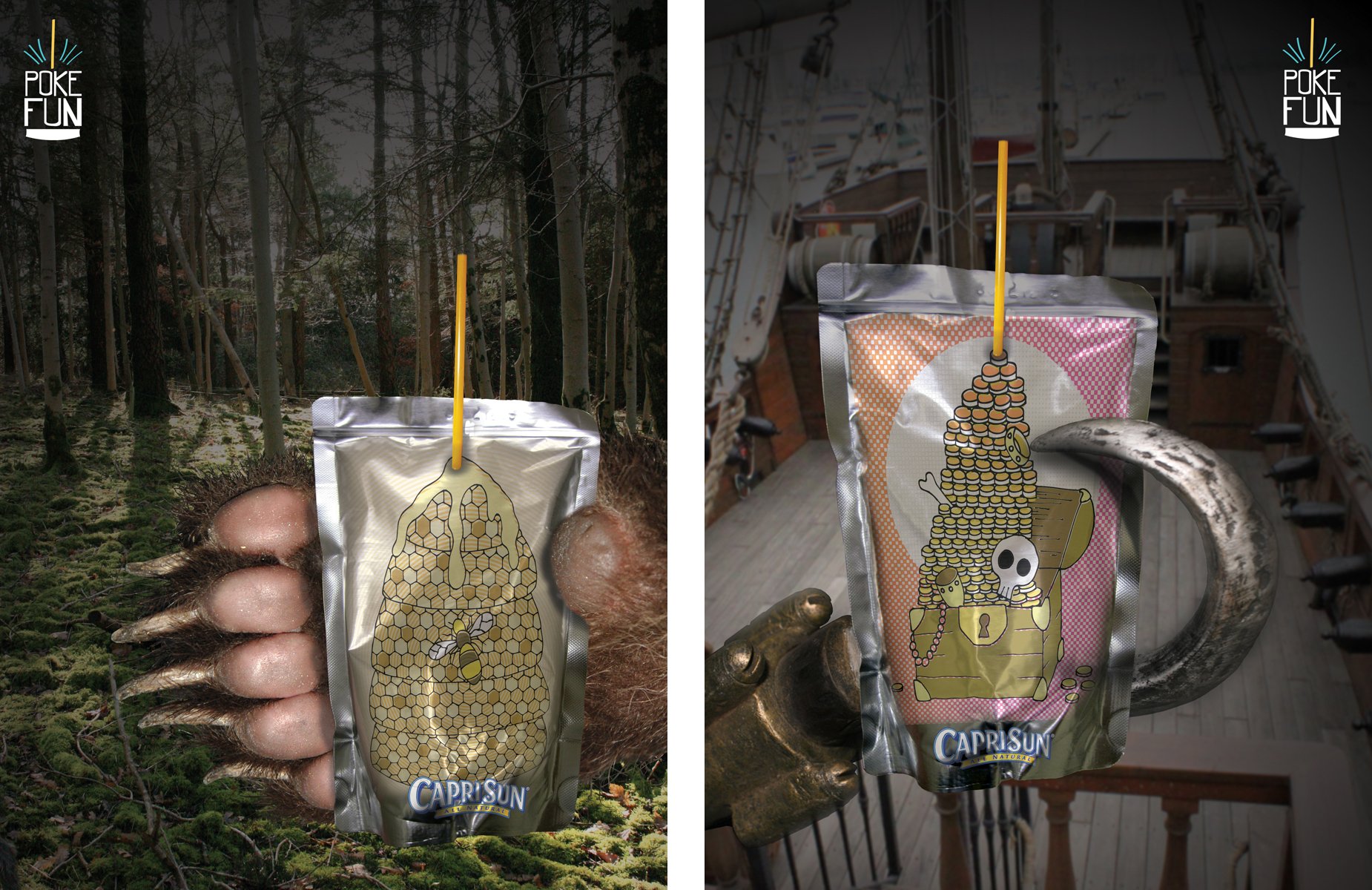
This is a fun and smart idea! It features Capri Sun’s iconic packaging 👍 And the tagline “Poke Fun” is perfect. Great job leveraging a product differentiator.
The print ads look scary, though. That paw and hook look dirty, too. Not great for a beverage ad. Maybe everything can be playfully illustrated? Also, ditch the “Pretend Hands.” It feels confusing and limiting.
Let’s just focus on the fun pouches. Maybe explore how some fun headlines might look in custom hand-drawn type. What is there to be said about this wackiness? Are the flavors funky as well?

Great packaging idea. The packaging offers a flat surface for the art to really shine. Maybe kids will even collect them! There can be different editions for different holidays. The possibilities are endless. Come up with a system and have at it. Fun stuff.
Something to think about: How does the flavor and other mandatory information get incorporated into the design?
iTouchless (Automatic Trash Cans)
Trash cans are dirty. Touch them less.

These print ads are fun. It’s very true that nobody wants to touch a grubby trash can 🤮
The logo lockup is a bit of a downer, though… How can we make that feel more clean? Maybe analyze how cleaning products are advertised. How do they suddenly switch from a dirty scene to a clean solution?

It makes sense to explore dirty trash cans in real life! (Cue me awkwardly trying to throw trash away while completely avoiding touching the lid.)
I think these installations have to be absolutely disgusting. Think of the Bloater from The Last of Us. Go crazy with it! Make it something people want to photograph and share.
And maybe the product reveal can be a separate stand next to it somehow. I wouldn’t put it directly on the trash can. Let’s create some separation between the Icky Icky Problem and the Cleany Cleany Solution.
Rohan
Rohan offers a wide variety of clothing technology. Anti-Insect BiteGuard is the most interesting.

These are a bit of a stretch. What are mosquitoes afraid of? I don’t think they’re afraid of zippers and buttons. The closest one is maybe the snake. Do snakes even eat bugs? And the third ad isn’t even really highlighting the article of clothing, but a creature inside the clothing.
What if we zoomed into the fabric? Highlight the technology? I don’t know. This is a tough one. Cool product technology, but these ads aren’t selling it properly for me.

A bit random and inelegant, but at least I get it. These clothes repel bugs. Got it.

What is this, a shirt for ants?! This is sensible media placement (“Looking for bug repellent? Check out this bug repellent shirt!”), but how do we make it more creative? Should we have a mannequin showcasing the clothes here?

Smart media placement. People are in “Learning Mode” at the science museum, so maybe they’re more receptive to learning about anti-insect clothing technology.
Let’s make it more fun and creative, though. Why is the mannequin in a glass case? How does the fabric work? Is there a real demonstration we can do here?
Parenting Magazine
Kids grow up fast. Keep up.

The “Good News / Bad News” headline setup feels natural. That’s definitely something true about parenting. As a father, I have experienced that myself many times!
These illustrations aren’t working, though. They’re basic. Explore something more playful. There’s something interesting in the juxtaposition of the two sides. See how else you can execute a split screen layout.
Ditch the images of real magazines on the bottom. Too busy. I think a simple logo and tagline will drive this home.

This just looks like a random informational sheet with legal information on it. If you want to include a free pamphlet or brochure with a birthday candle, let’s make it INTERESTING. I think targeting parents who are planning birthday parties can be pretty smart, but the execution also has to be eye-grabbing as well.

The idea of something being “outgrown” is fun. All parents know what it’s like to realize, “Oh wow, these pants are now way too small for you.”
How else can we explore this? A piece of paper outgrowing its envelope is pretty far removed from the world of parenting. Keep pushing and see if anything can come out of this. This might not work because the idea of a kid outgrowing something is pretty personal, so I don’t know if you can send something that will achieve that same emotional realization of your own kid getting too big.
European Wax Center
Shaving only removes so much.

I’m a sucker for conceptual landscapes! To me, these ads function as provocative art pieces. I don’t know if European Wax Center would go for these gnarly vibes, but there’s something visceral about this. I see these ads as a window into your personal taste. I can see these ads falling into the “Love It or Hate It” category.
ChoiceDek
Decking material that animals would approve.

Interesting visual… “I can’t believe it’s not wood!” 😂 Yeah, it’s absurd, but I get it.

I would simplify this. Maybe just a cool calculator that illustrates how many trees you save will suffice. Educating customers about the amount of trees that needs to be chopped down sounds like a smart way to reach the hearts of environmentally-conscious homeowners.
Military Channel
Bring the war home.

That dude watching TV on the right looks bored. I love the idea of your living room becoming a battlefield, though. Let’s play into that more. Let’s make it intense! Rearrange the furniture! Toss a “grenade!”

This looks like a “Frequent Flyer” app for a TV channel. Sure, why not? It’s not particularly creative. It’s skinned to be military (achievements = medals), which makes sense. But feels like you can push it to be more fun and interactive.
Alright! Overall, it’s a decent portfolio with a lot of room for refinement. It shows me that you went through a top tier program and have gone through the process. You’re just coming out of school, so I don’t expect your execution skills to be professional yet, but there’s a lot of opportunity for polishing here.
You have some pretty fun and interesting ideas, so take what’s good and keep pounding it. Have fun and good luck!